
6 Tips to Help You Create a High-Converting Sales Page
8 min read
You know the page you land on when you’re about to purchase a product? Yeah, that one. That’s a sales page.
With a successful sales page, you convince visitors to convert into paying customers right on the spot.
What elements make a high-quality sales page? The design or visual elements? Persuasive sales copy? You must go beyond the primary page tactics to ensure your page is more sales-focused.
Read on to learn six tips for creating high-converting sales pages.
- Clear All Distractions
- Add a Clear CTA
- Highlight the Value Proposition
- Use Exit-Intent Popups
- Write Compelling Headlines and Subheadings
- Include a FAQs Section
1. Clear All Distractions
Your sales page aims to get visitors to pull out their credit cards. When you have several visual elements, navigation links, CTAs, and jampacked text on a sales page, you risk information overload and confusion. That defeats the purpose, tanks conversion rates, and causes you to lose sales.
Do the following to maintain a clean design and clutter-free page:
- Trim the fluff; not everyone reads the text anyway. Excessively long copy might increase visitors’ time on page, but it might also wear them down before they choose to convert.
- Use only necessary images to support your copy. Images engage visitors and demonstrate the benefits of your products and services. But too many can be distracting.
- Skimp on navigation links. Ideally, internal links should improve bounce rates and dwell time. But too many cluttered links are distracting and counter-effective.
Instead, test your sales page to know if visitors actually click on those links. Then optimize based on the results. Alternatively, you may include and test a shorter navigation link that leads to the homepage or checkout.
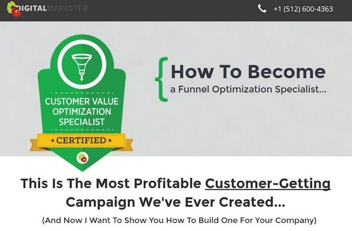
Below is an example of a poorly designed sales page:
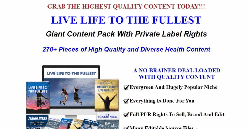
If you’ve been following, the above example should give you a headache.
The sales page has several different fonts to make you dizzy and more fluff than a chiffon cake. Agreed, it’s supposed to be a long-form sales page, but the copy and visuals are tacky and everywhere.
By contrast, see this example by Somnifix.
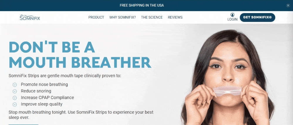
Somnifix’s sales page works because it has a consistent design that is gentler on the eyes and conveys value in fewer words and visually appealing images.
For a clean layout, maximize your designs with negative space. Sales aside, negative or white space in UX design is both a B2C and B2B web design best practice that can boost user interaction and engagement.
It also makes your page look classy and guides the viewer’s eye to necessary information that’ll lead them to convert.
2. Add a Clear CTA
The problem with having an unclear CTA is that it leaves visitors clueless. Think of it this way; your CTA determines whether a conversion will happen or not. If the CTA is hidden, prospects will not take action, which is counterproductive for your marketing campaign. But, a clear CTA tells the visitor exactly what to do.
Typically, the CTA on a sales page will be to purchase a product. But just saying “Buy Now” won’t cut it. Your message should include product benefits and value to support the pricing and accepted payment methods.
You can have up to five CTAs on a long-form sales page. However, you’ll want to break up these CTAs with relevant text that reinforces your message and gets visitors to keep reading.
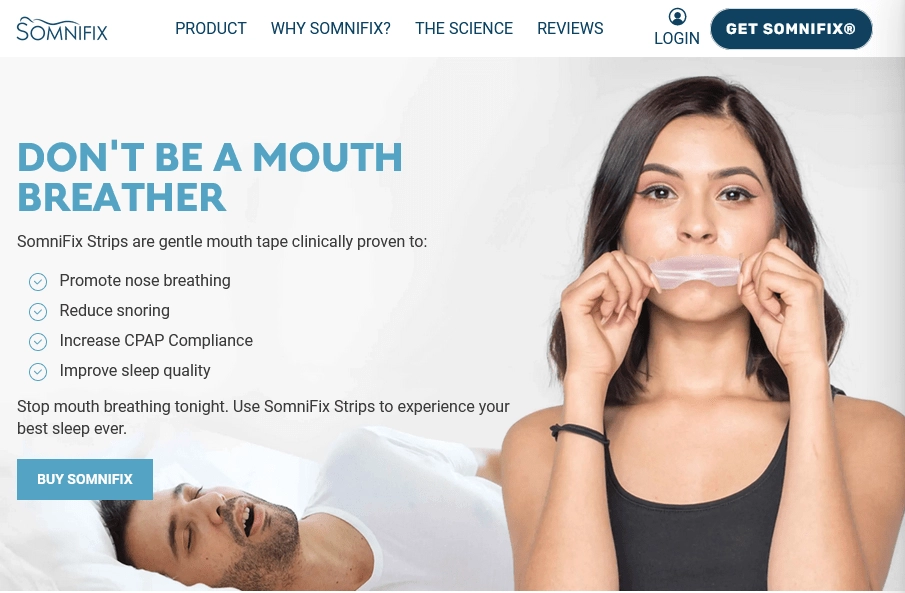
For a short-form sales page, highlight product or services benefits in bullet points and place the CTA beneath them, as Somnifix does:
Ensure your CTA button copy has clear, strong imperatives that support the offer. Also, avoid several contrasting CTA button colors that will make the page tacky. Learn the other common CTA mistakes and avoid those, too.
Then, to close the sale, make your final CTA more noticeable than others on the sales page. Add any bonuses, monthly payment offers, and value propositions to reinforce and close out the offer.
3. Highlight the Value Proposition
Your value proposition is a unique selling point that differentiates you from other businesses. It communicates to prospective customers the benefits of your products and why they should choose you over your competitors, increasing the chances of conversion.
See how Eat Fat, Get Thin Cookbook conveys their cookbook’s value proposition cohesively within their sales page copy.
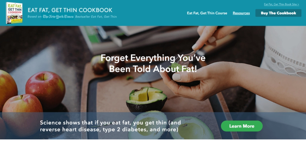
The above page doesn’t just state what the company is about. It also enumerates facts that might convince customers to buy the cookbook. The company reinforces these throughout the sales page — from their headline to the bottom of the page.
Like the above example, you may highlight your value proposition above the fold or somewhere else that’s not hidden. But, strive to keep it simple, short, and enticing.
4. Use Exit-Intent Popups
Many people can agree that popups have a fairly bad rep. They’re obtrusive, sometimes poorly timed, and potentially spammy. All these can disrupt the user experience when not checked.
But if you use popups the right way, you may be able to turn the tables around. Wishpond makes it easy for you to build and control where you place your popups, and the perfect time to trigger them.
The exit-intent popup re-engages website visitors when it senses they’re about to bounce. The ad usually pops up when you hover your cursor on the upper right corner of the screen—close to the “ ‘X’ marks spot for exit” button on the browser tab.
As a result, they’re a powerful last-chance opportunity to drive conversions on your sales page. You can use exit-intent popups to offer a bonus or incentive in exchange for a visitor’s email address, get email signups, increase downloads or reduce cart abandonment.
Alternatively, you can offer them a product demo:
That will get them to try out your product first, then hopefully pull out their credit cards in the future. Good thing exit-intent popups also get you access to their email address information, which you can use to nurture leads to conversion.
5. Write Compelling Headlines and Subheadings
You know what they say: “miss them at the headline; miss them forever.”
Not sure about the ‘forever’ bit, but given that 80% of visitors read headline copy, but only about 20 percent read the rest, I wouldn’t pass this up.
Put simply, if your headline is weak, other vital elements on your sales page won’t matter. As important as the headlines are your subheadings.
While the headline aims to persuade a visitor to read the rest of your copy, the subheading supports the headline by providing additional information. Unfortunately, if the subheading drags, the reader will also drift.
So, how do you write the best sales copy headlines and subheadings that yield results?
Be simple and direct: No clever baits, no jokes, and no word plays. Go straight to the point.

You may use straightforward headlines like this one by Keith Urban if you’re a recognized brand or offer familiar products or services.
State the best benefit upfront: You’ll attract your ideal audience by vocalizing the significant benefits in your headline. It’ll also get them to respond faster than if it were a generic headline. Additionally, your subheadings should support these benefits by addressing and tackling the visitor’s pain points.
Consider hooks that spike curiosity and appeal to emotion: If you’re not a known brand or business, use headlines and subheading hooks to attract your target audience. Why? Great hooks demand attention. Your hook may include questions about your prospect’s pain points or something that appeals to your ideal target audience.
It’s also effective to make a bold and descriptive promise in your headlines. Such headlines inform potential customers about the benefits they’ll get from reading your copy, upping chances of conversion.
6. Include a FAQs Section
The frequently asked question section on a sales page includes a series of answers to pressing customer questions. To maximize the FAQ section’s potential on your page, avoid answering generic questions. Zoom in from the customer’s point of view:
- They’re skeptical
- They’re busy and would rather be spoon-fed information than get on a long call or send you an email
- They know next to nothing about your company’s product or services
These reasons can make visitors reluctant to buy.
So, what to do? Talk to customers often. Use feedback tools like customer surveys, Twitter polls and forums like Quora or Reddit to get insight into pressing industry questions your product can solve.
Here’s some neat inspiration from Stop Fighting Food, an online program set up to help people struggling with what it calls the “diet mentality.”
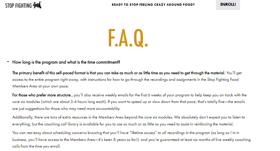
Notice that the questions are the typical questions a person interested in the program would ask. If you scroll down, you’ll see the brand also gives responses that aim to overcome common sales objections.

The brand even goes so far as to provide prospects with an email address they can contact if they still haven’t been convinced to push that “Enroll” button.
Over to You
High-converting sales pages can pull the heavy weight of convincing potential customers for your business, but only if you do it right.
You learned six tips to follow so you can create a high-converting sales page.
- You need to cut the fluff in your copy and go for less-cluttered page designs. You want to ensure your page is clear of anything that might distract your visitor. So, include only relevant elements that support your copy.
- Make sure your CTA is clear. It should be easily understandable so that your visitors will know exactly what to do and visible on the page. Include your product benefits as well. You want to give visitors something that will prompt them to push that CTA button.
- Highlight your value proposition on your sales page, too. Enumerate other facts that might convince your visitors to buy your product. Keep everything simple and concise. You may also opt to disperse that value across your sales page, from the headline to the bottom of the page.
- Use exit intent pop-ups. They’re a powerful way to get visitors who are about to leave your site to convert instead. With the exit intent pop-ups, you can offer a bonus or a free demo. You can also offer other incentives to get email sign-ups, for example. Use Wishpond to build these pop-ups. You can specify where you want them and the time to trigger them.
- Write compelling headlines and subheadings. State the best benefit first and be simple and direct. You can use hooks that appeal to the emotions to get your visitor’s attention from the get-go.
- Include a FAQs section in your sales page. Aim to answer the most common questions and avoid answering generic questions. Also, use this section to overcome possible sales objections.
The truth is, there’s no set-in-stone way to create these pages. Just start, test, optimize, and tweak. With time, you’ll be able to generate quality traffic and land more sales.
Proposed meta description: Are your sales pages not yielding the results you’re looking for? Read on to learn six tips to help you create a high-converting sales page.
___

Ian Loew is a web entrepreneur and inbound marketing expert, and the Owner & Head of Business Development of Lform Design. After four years of helping Fortune 500 companies with MGT Design, Ian embarked on his freelance career before establishing Lform Design in 2005. He leads a team of creative professionals to deliver inspired online experiences via modern, responsive websites that reflect his clients’ core values. When not at the helm, Ian can be found mountain biking with friends or spending time with his family.
guest